
My favorite brushes for clouds, fur and landscape backgrounds are the Isabey Mongoose filberts from Blick. Also, the series 278, Master's choice Long Filberts from Rosemary and Co. Both hold up very well with long term use. Both are a great choice when you need a nebulous soft look to your brushstrokes.
Tube Wringer: Available from Blick Art Supplies
Art Supply of the Week - Tube Wringer
Paint is expensive so one of my favorite ways to get the most out of each tube is to use a tube wringer pictured above. There are plastic ones and metal ones available on the market. I prefer the metal one because it can stand up to the job of squeezing the life out of a spent tube of paint; even one with pigments as thick as stack lead white. I've had the one above for many years and it works and looks just as good, minus the small bits of paint, as the day I purchased the tube wringer.
Art Supply of the Week - Utility Brushes
Utility Brushes
Robert Simmons Titanium -filberts and flats.
These great synthetic bristle brushes from Robert Simmons are my go to brush when I need to scrub in an underpainting or really any job where I wouldn't want to use my most prized brushes. They really hold their own to a lot of abuse. I've even used them to prime small panels. They are softer than hog bristle brushes and easier to care for as well.
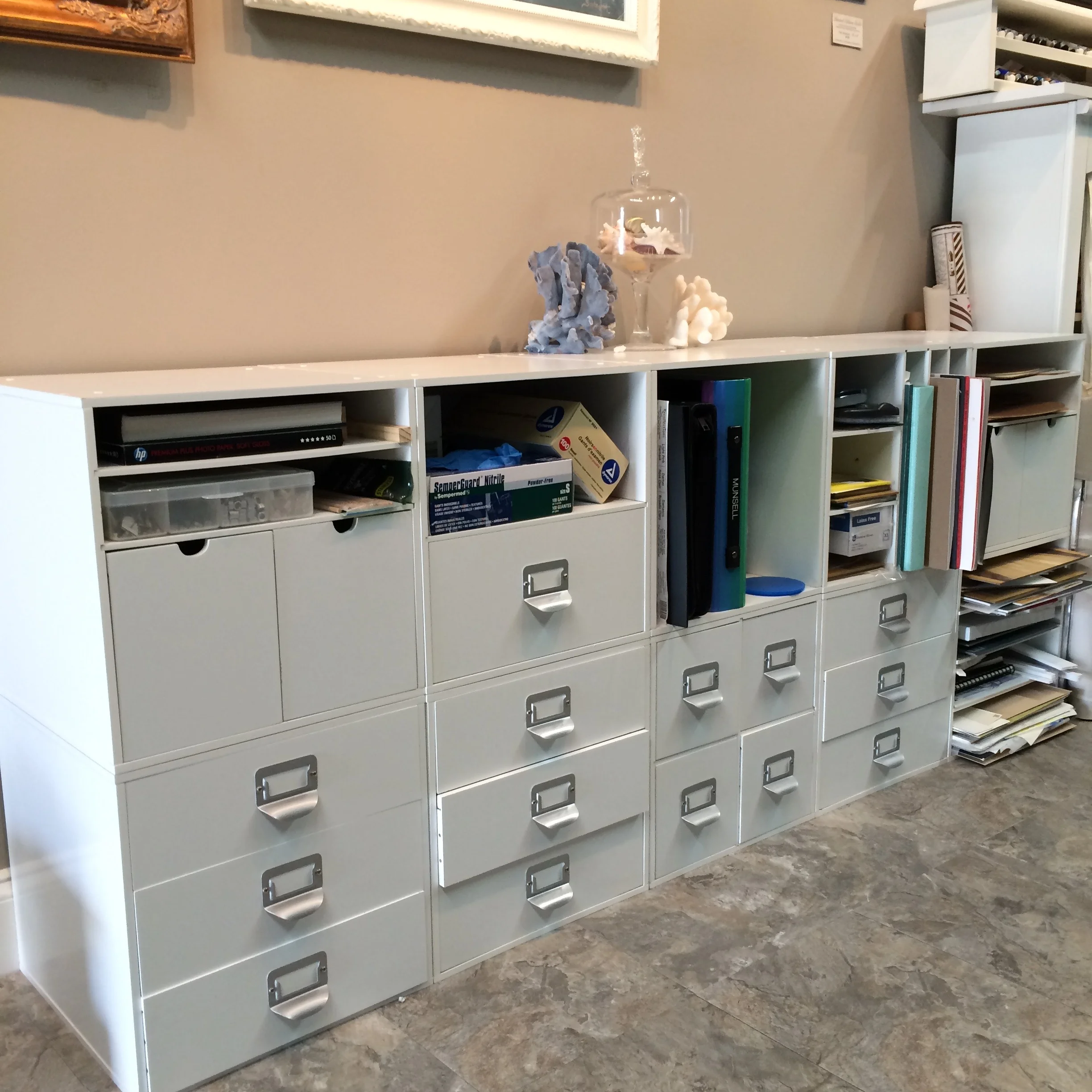
Ideas for Organizing an Artist's Studio
A couple of months back someone asked to do a post on how I organize my studio. Here is a peek at some of my favorite items that help keep my studio tidy, organized and efficient.
Organizing my Brushes..
I have a lot of brushes and being able to quickly find the one I need is important to me. I use these little bamboo containers from Blick for my brushes. I molded clay into the small bamboo chamber on the underside, let the clay dry and then glued it back into the depression. This counterweight keeps the containers from tipping over and damaging the brushes.
My Worktable
I use the Studio Designs Futura Craft Station with a Glass top to store all of the things I use most regularly during my painting sessions. There are little divided trays on each side that hold pencils, erasers, tubes of paint and my tube wringer. The drawer is the perfect height to store individual tubes of paint, palette knives, and other little necessities. That drawer contains only the tubes I use on a daily basis as my core palette of colors and in the order in which I place them on my palette. That way I'm never wasting time searching for a color I need. To keep visual clutter down I cover the top with neutral gray palette paper.
Storing tubes of paint...
Several years ago I built this little shelf for storing and organizing my tubes of paint. I store them with the caps down as I tend to favor hand made paint without stabilizers and other additives. Over time some of the oil naturally separates from the pigments and storing them in this manner helps keep the oil in the tube. I can quickly and easily find any color I'm looking for with this shelf for my paint.
Organizing all those little odds and ends...
I get these modular storage squares from Michaels. They are wonderfully versatile and can be stacked in any configuration. With all the differently shaped cubbies and drawers it is easy to keep clutter in check and supplies easy to find.
Munsell Part 3: Controlling Chroma
When painting I use two methods to simply and easily control chroma. The first, and the one I use most frequently, are neutral grays. The second is through the use of close complementary colors. A personal preference of mine is use complementary color strands when I'm painting subjects such as skin and flowers. However, neutral grays will work very well for these subjects as well.
Neutral Grays
Unless your subject is translucent, when rendering three dimensional forms it becomes necessary to subtly lower the chroma as the form drops in value as it turns away from the primary light source. If you were to add black to your mixture to achieve the color for the shadows it would drastically alter the value, the hue and the chroma and cause you to work much harder to find the right mixture. This is where neutral grays come in and simplify the painting process. If you have a strand of neutral gray in different values it becomes quite easy to lower the chroma and value slightly by adding a tiny bit of the proper value of neutral gray to your mixture. This is one of the most predictable ways of neutralizing chroma.
Below you can see a palette containing a strand of red at different values and constant chroma. Immediately below the strand of red is a strand of neutral grays in the values I would need that day. Note that I did not mix the darkest value neutral as well as a couple of others as it would not be necessary for that painting day. If you absolutely know that you will not need those values then save the mixing time and paint. But in the beginning it's helpful to mix a full value range. To achieve the strands of neutral gray I used Iron Oxide black or ivory black, raw umber and white. This combination gives you a perfect neutral gray, and using them in different proportions helps you achieve the different values. You can use the chips from your Munsell Student Text or the big Book of Color for a comparison of neutrality in your paint mixtures. Some companies, such as Williamsburg, have premixed tubes of neutral grays available for purchase.

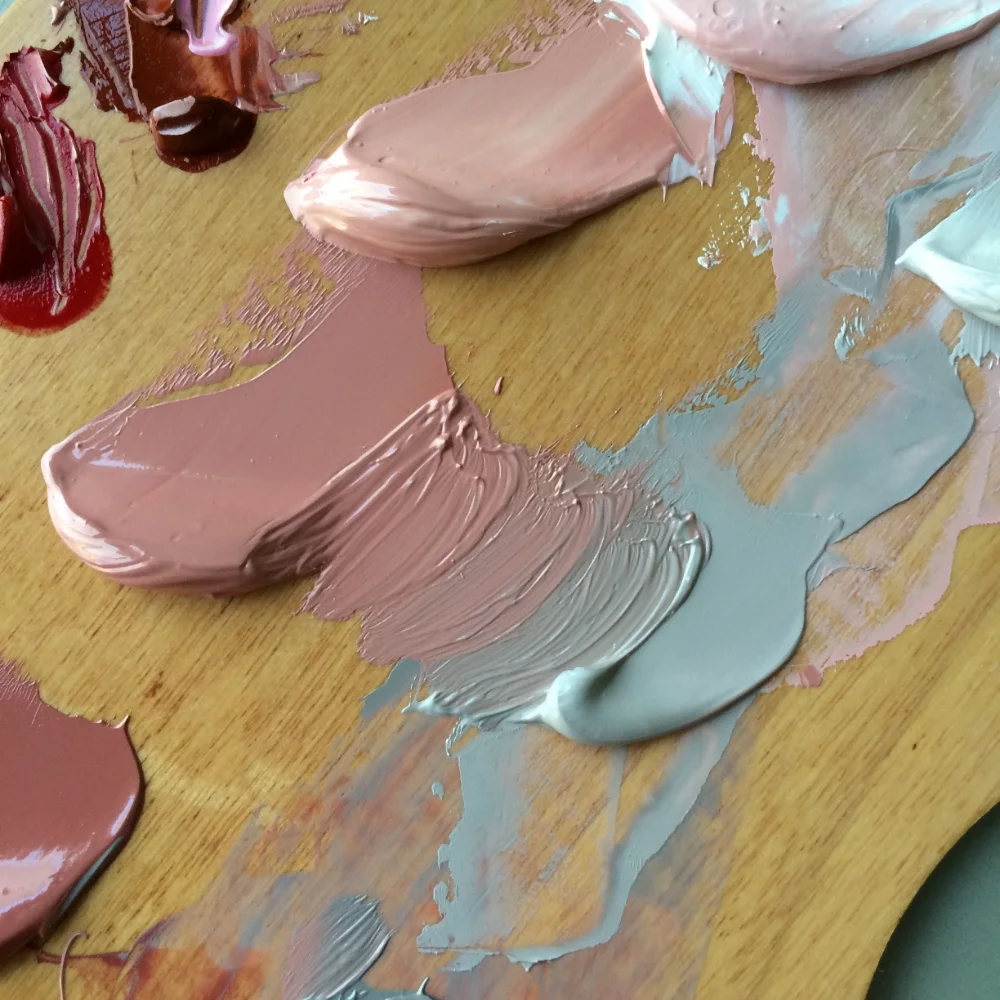
Above you can see a red and a neutral of roughly the same value. When these two are combined in different proportions it is possible to achieve a range of chromas in-between neutral and the chroma of the original red hue.
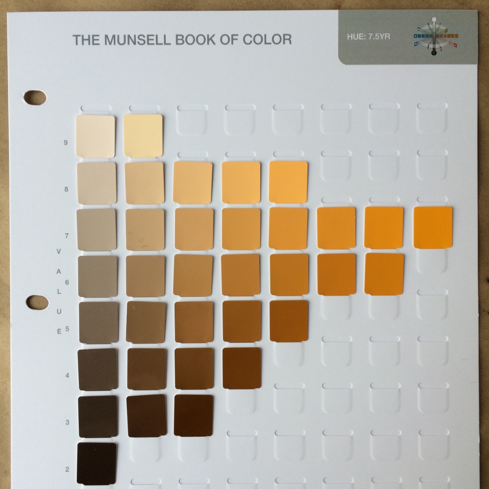
The photograph below is a page from The Munsell Book of Color for hue 7.5YR. The horizontal rows depict changes in chroma at specific values for hue 7.5YR. Chips on the far left are low in chroma, near neutral at a chroma of 2, while the chips on the far right depict the highest chromas achievable at this particular hue and value combination.
Using this chart you can visually see how a specific hue and value’s chroma will change as you add an increasingly higher proportion of neutral gray of the same value. The chips also illustrate the different chromas that are possible with that hue at different values. Note that both lighter and darker values for this particular hue are limited to low chroma.
Complementary colors
The use of complementary colors to neutralize chroma often comes in handy with flowers and flesh tones. The premise and application is the same as the neutral grays except for you would be using color. Be careful to watch for shifts in hue with complimentary colors. Using the chart from The Munsell Book of Color depicted below you can estimate your complementary colors. I left the file size large so that you can print the image. Once you have the hue identified on the wheel you can use a ruler to find the complement that is directly opposite to your hue on the wheel. For example 5R's complement would be 5BG. (Below image from munsel.com)
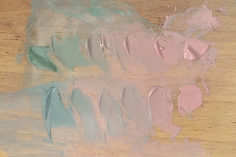
Above you can see a comparison of using a green complement of similar chroma and value on top and a neutral on the bottom. Both achieve the same end of effectively reducing chroma. However, it should be noted that complements often cause greater hue shifts (vs neutral grays) and that may not yield the desired hue.