

Image credit: Veronica Winters.
Art Lessons in Realist Drawing, Painting, and Beyond includes insightful interviews and demonstrations by internationally known artists such as Daniel Sprick, Anne-Marie Kornachuk, K. Henderson, Linda Lucas Hardy, Tanja Gant, David Gluck and many more. I'm so honored to be counted among them in this beautiful book and even on the cover!
You can purchase a hard copy or digital copy on Veronica's website: http://veronicasart.com
Please enjoy the following excerpt of my demonstration of "Recipe for A Beautiful Day" included in the book.
Workspace Setup
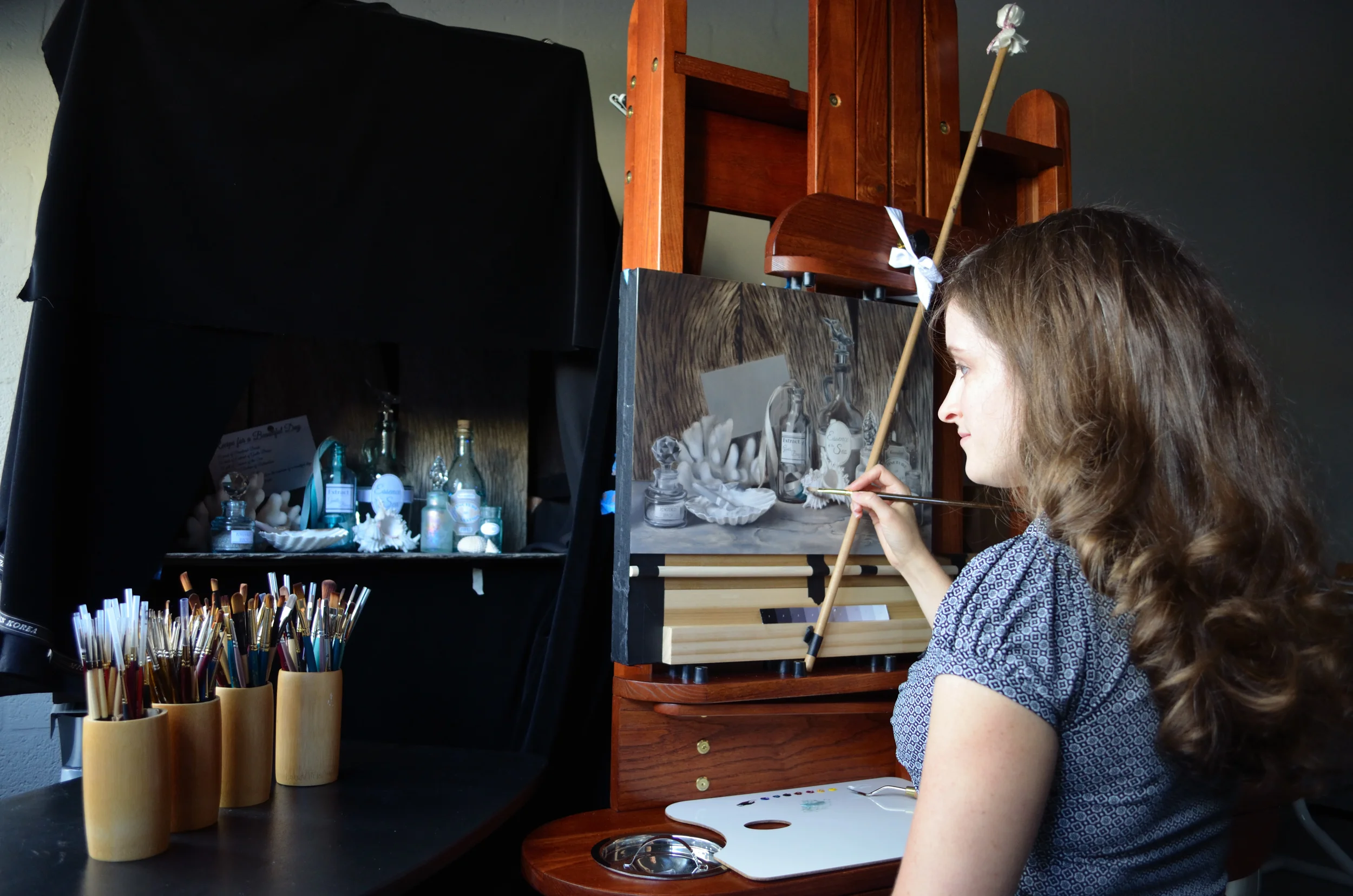
Before beginning I placed my shadowbox and black velvet curtain on a bookcase and aligned my easel and painting panel with the still life stage in front of a northern facing window as shown in the picture. (A shadowbox is a wonderful way to have complete control over your lighting in your still life composition.)
Step 1: Designing the Still Life Composition
In this step I will discuss the thought process behind composing the objects in my still life.
First, I placed weathered barn wood and a slate roof tile into my shadowbox for the background and stage for my still life. The colors of these two natural items harmonized well and I felt that also created a nice ambiance for the story. Next, I added all the bottles and seashells I thought that I would be using onto the stage and arranged them in a visually pleasing manner.
I felt that the story could be best told if I added labels to the bottles to imply their contents. I also changed the size of the recipe card as I felt it was too large for the composition. Although they were relevant to creating a recipe, visually I found the metal measuring spoons to be visually distracting and so I removed them and added coral.
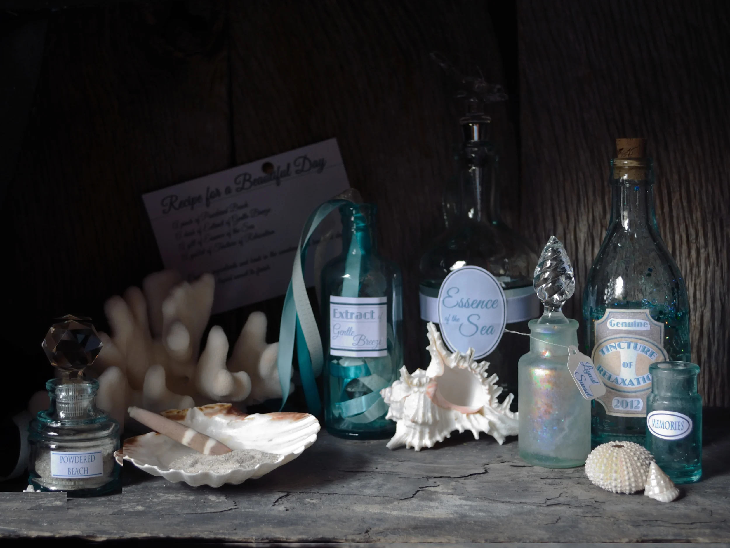
Because this was a story about the sea, I needed a couple more sea creatures, and therefore, I added the small white and pink Murex Ramosus shell. I like to repeat textures, shapes, and colors throughout my compositions in order to both lead the eye and create more visual harmony. The coral was a good match for repeating the spikes of the Murex shell as well as being similar in color and texture to the sea urchin. The pink in the Murex shell also complemented the pinks in the bottle labeled "Liquid Sun Set" as well as the subtle pink in the sea urchin carapace. The brown in the shell I used to symbolize a mixing bowl harmonized nicely with the cork that I had tinted to match in a bottle across from it in the composition. The brown sea urchin spike in the same shell was also useful for symbolizing a mixing spoon. I replaced the small white and brown murex shell for one that was more conical to lead the eye back into the composition and also repeat the similar shape of one of the glass stoppers. Finally, I moved the bottle labeled powdered beach to the left side of the composition to balance the bottles in both color and texture.
I then adjusted my black velvet curtain over part of the front of my shadow box so that it created a more interesting lighting effect on the objects. I made sure that both the visually busy recipe card and highly textured weathered wood panels were in more shadow and would recede into the background making the foreground objects more pronounced. At this point I felt satisfied with my still life composition and was ready to move onto the next step...
I hope you enjoyed this excerpt. In the book I go on to discuss in detail my materials, drawing, underpainting, final color layers and my in depth approach to achieving many convincing textures found in this still life as well as varnishing techniques.
You can purchase a hard copy or digital copy on Veronica's website: http://veronicasart.com