
Designing a Color Palette
There are multiple ways to achieve a visually harmonious color palette. One could use a basis of monochromatic, dichromatic, analogous, split complementary and complimentary color schemes. There are many other color schemes such as tetradic and triadic and too many more to cover in the scope of this blog. Therefore, I will only be discussing some of my personal favorites; monochromatic, dichromatic and analogous.
Monochromatic color schemes would contain a single hue family, such as blue, to the exclusion of all other hues. The color can vary in terms of chroma and value.
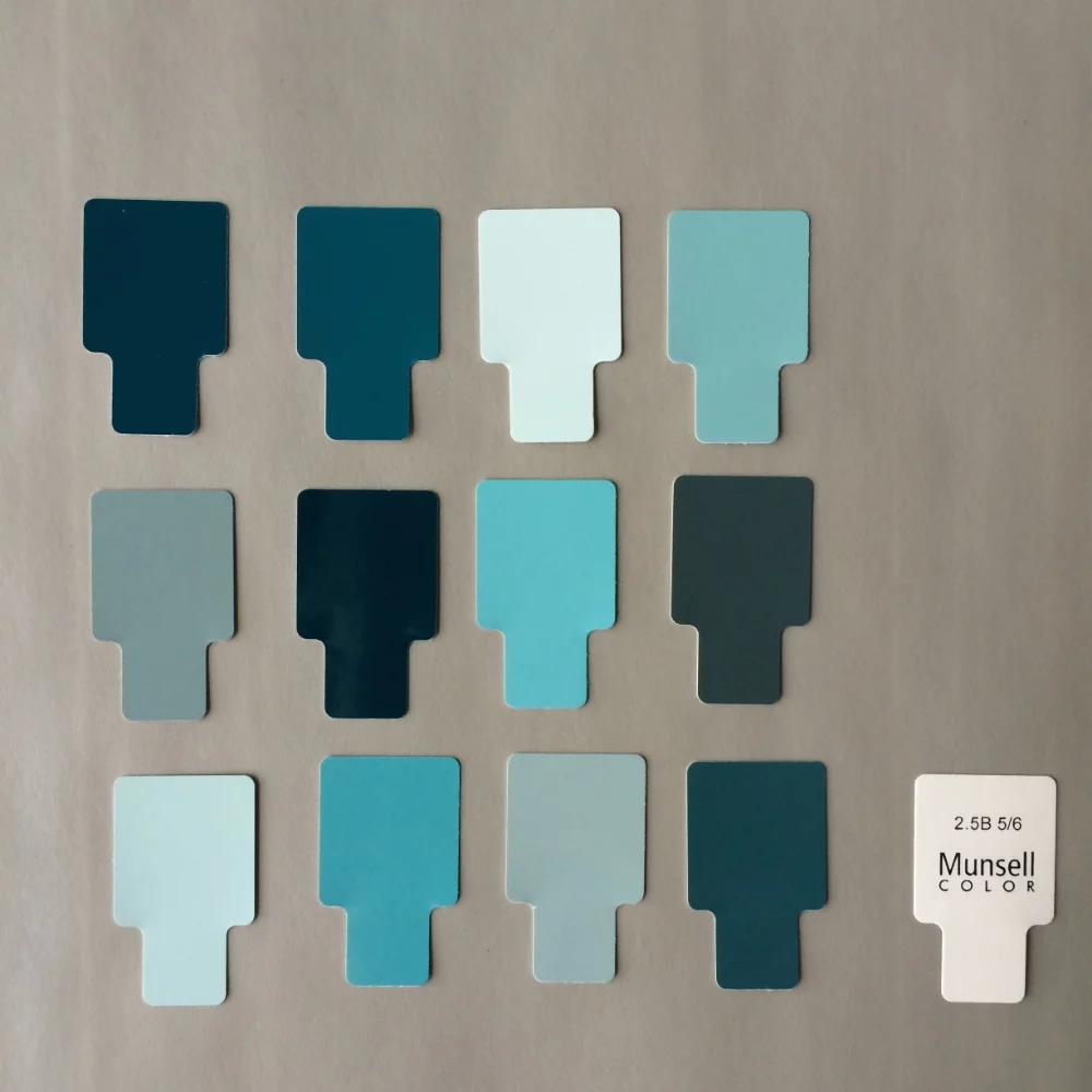
An example of a monochromatic color scheme incorporating different values and chroma of 2.5 Blue.
Dichromatic - one example of a dichromatic color scheme would be a color scheme that incorporates blue and green but excludes other hues.
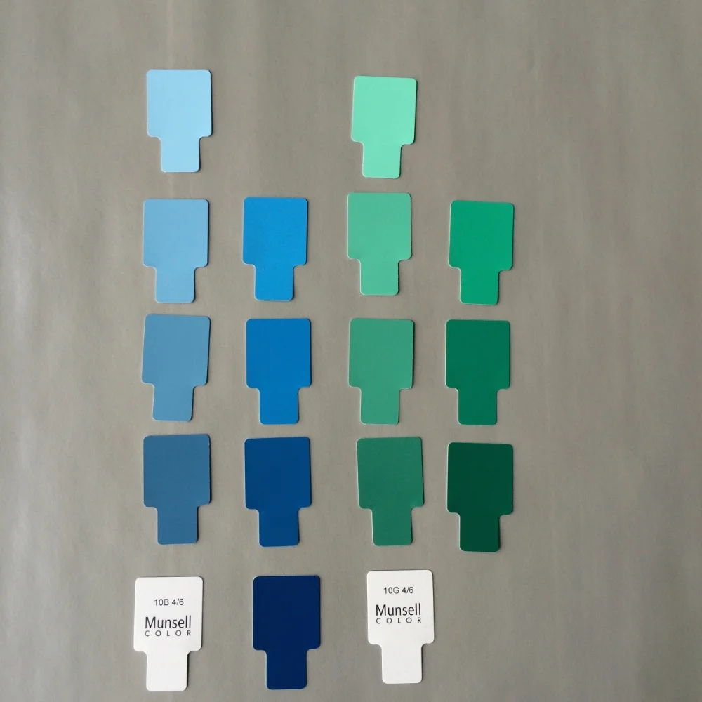
A dichromatic color scheme including 10 Blue and 10 Green at different values. Both the blue and the green are limited to a chroma of 6 and 10.
Analogous color schemes contain a group of colors that are adjacent to one another on the color wheel. One example would be a color scheme that includes red, yellow-red (orange) and yellow and another possibility would be the example below.
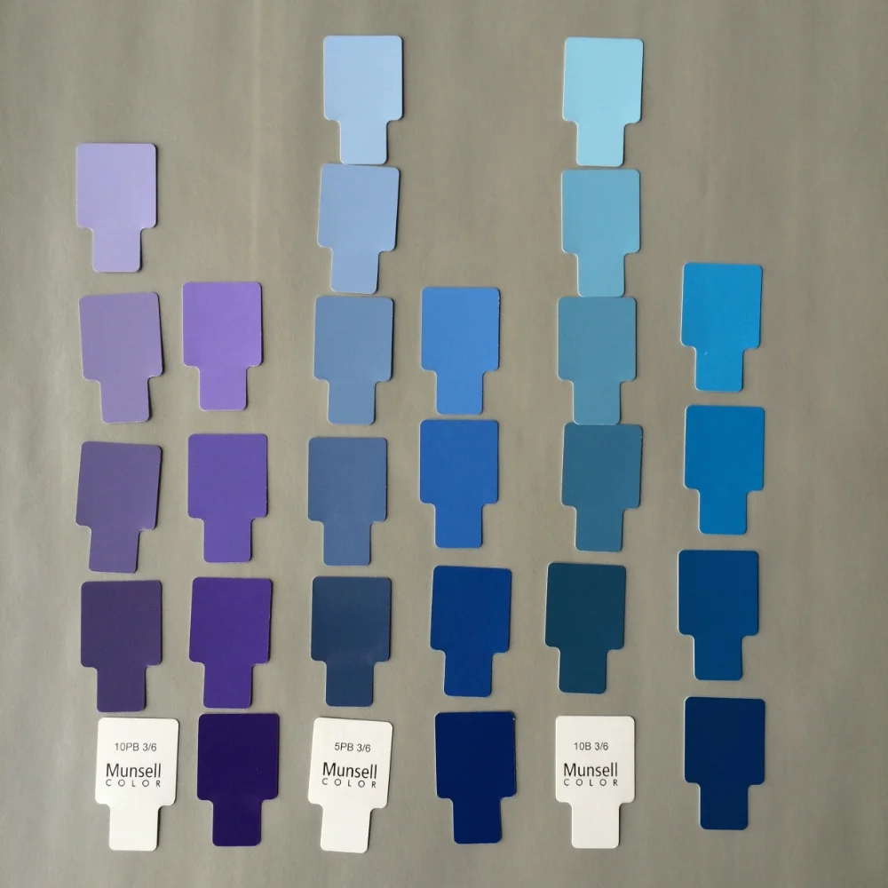
An example of an analogous color scheme with a space of 5 Munsell hue designations in between each chosen hue. The chroma included for each hue is a chroma of 6 and 10 with values between 7 and 3.
Designing A Palette
Generally, I do not have a specific color scheme classification in mind when I set out to design my paintings. Nevertheless, my accidental personal favorites seem to be imperfectly associated with monochromatic, dichromatic, and analogous color schemes as they give me a sense of quiet serenity that I seek in my work.
When designing a color palette for one of my paintings I like to start a neutral. Why use a basis of neutral for designing a color palette? Using a large proportion of a neutral vs the subject matter enables the viewer to quickly discern what parts of the composition are the most important. When an object of higher chroma is placed over a neutral our attention naturally turns to the higher chroma object. Neutrals recede and higher chroma objects have the illusion of being closer to the viewer.
For example, when I used to paint still life paintings, I would start with a neutral color like wood, slate or stained wood that were low in chroma. I would then add in more colorful elements such as colored glass, ribbons and sea shells that were higher in chroma. The focus of the painting would automatically be these more brightly colored objects and the background of wood or slate would recede.
Next, I pick a color family that complements my subject and add variety by including slight variations in hue and chroma until I am satisfied with the resulting color palette. For instance with sea shells, I would add ribbons that were slightly higher or lower in chroma and value than the shells but were identical in some aspect of their hue. Finally, I often limit the chroma of my subject matter. Having a flower blossom who's chroma is a very vibrant 14 would take too much focus away from my figure who's skin tones often range from a chroma of 2 to 4 in my paintings.
In The New Munsell Student text it mentions that a color will harmonize with another if it shares two characteristics in either hue, value or chroma. In most of the the examples above I often varied the hue, while keeping the chroma with in the same two numerical classes. As we are painters and are rendering light as it acts on three dimensional forms, I also included a small subset of values. The rule of two shared characteristics is a great starting point for designing color palettes. However, like most rules in painting, this one can be bent and still yield beautiful results. A lot of beauty in color schemes comes from limiting your options in hue and especially chroma, either through a limited color palette of paint or through the use of Munsell.
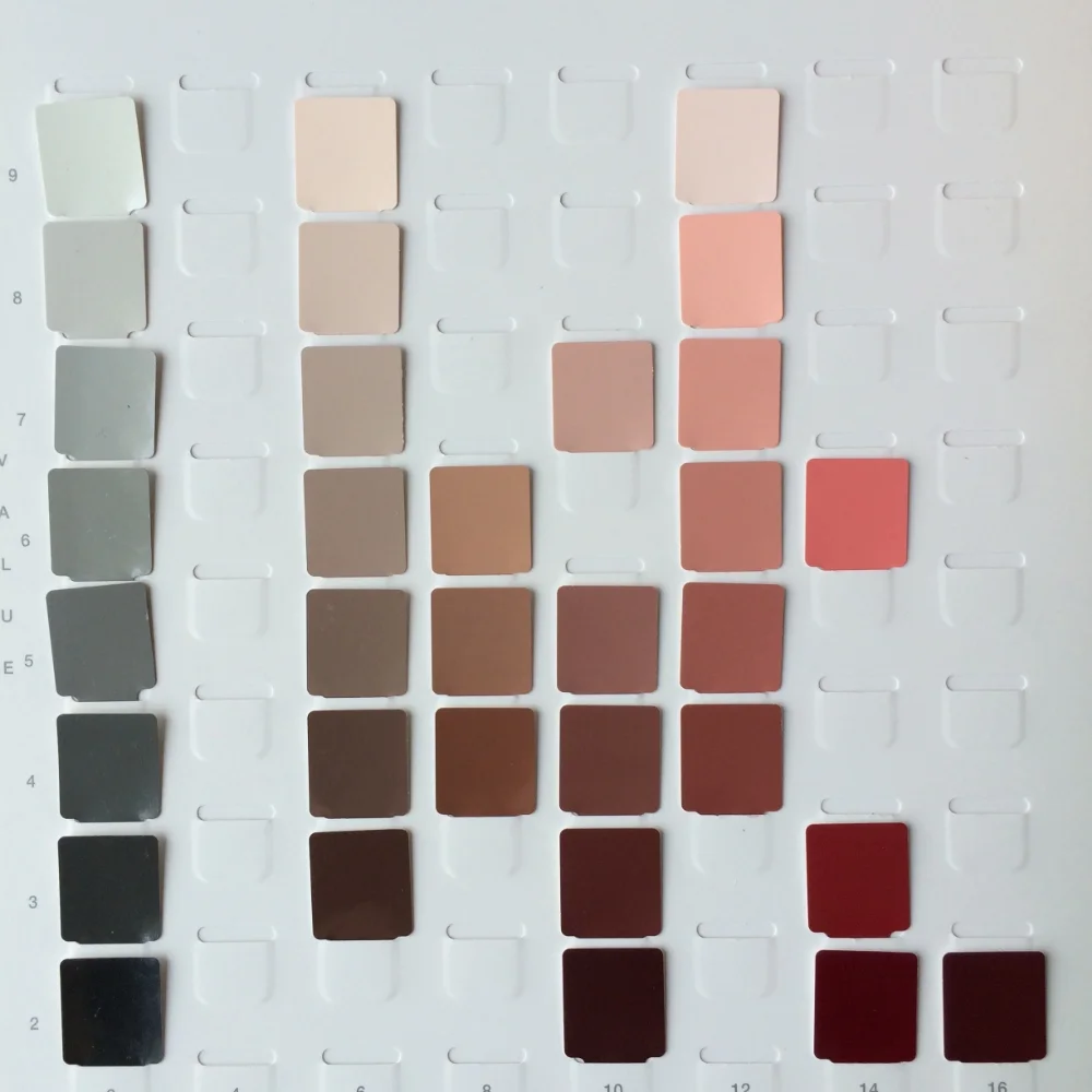
An example of a color palette design for an upcoming painting. Left: my strand of neutral gray that I like to have nearby for comparison of chroma and value. The remaining color strands are for my lower chroma background, model's clothes and flower blossoms.
Proportions of Constituent Colors are Key
When designing a color palette, proportions of the constituent colors are important. Take Magnetism below. Had I placed large amounts of high chroma yellow next to large amounts of high chroma red the composition would be anything but peaceful. However, small amounts of red and yellow with an equal quantity of yellow-red provided a visual transition between these two clashing colors. Placing the three over a large back drop of a neutral belonging to the same hue family created a harmonious palette of color as well as visual interest for my foreground subjects. The Munsell chips themselves will not visually provide you with a blueprint of your color scheme's proportions. For this, I highly recommend thumbnail sketches and studies. They are a valuable way to test out your paintings color scheme and value structure before you start your final painting.
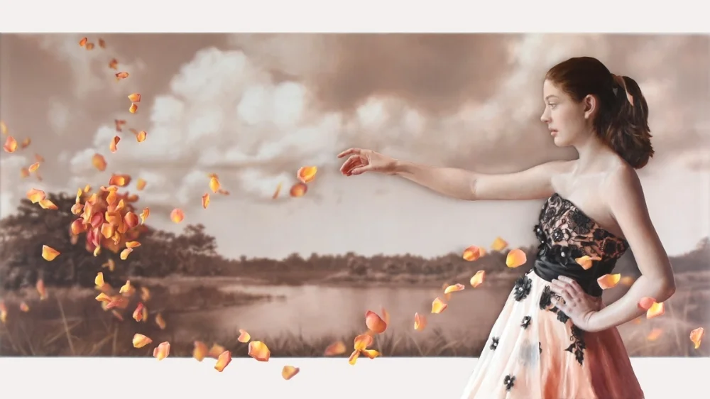
I would classify the painting Magnetism, depicted above, as an analogous color scheme painting. It includes Red, Yellow-Red and Yellow plus a low chroma yellow-red (more commonly referred to as brown) for the background.
Application of my Munsell Color Palette

In application, I do not mix every chip I choose in my color palette's design, just a small subset based on the subject I'm painting that day. On the above palette I mixed only a dark value Red, as well as some light and mid value reds using the chips for comparison. With the yellow I did not choose to use any Munsell chips and accomplished all premixing through the observation of my subject. These piles of paint serve only as starting points for the color decisions I will be making throughout the painting day. I extensively mix and modify, as you can see from the palette above, to ensure that I achieve the exact hue, value and chroma necessary to depict objects realistically. In the case of this painting day my subject was medium-high chroma flower petals containing both yellow and red hues with transitional oranges in between. I used a small amount of raw umber to neutralize the reds and yellows slightly when necessary.
Which brings us to the next topic on Munsell... controlling chroma.
The next post on Munsell will be sometime in November.