
I'm pleased to announce that my drawing "Quiet Reflection" has been awarded a spot in North Light Books' hardbound showcase of the best in contemporary drawing: Strokes of Genius 7: Depth, Dimension & Space! The book is scheduled to be released later in 2015. In the mean time, please enjoy the below demonstration of my methods and materials for this drawing.
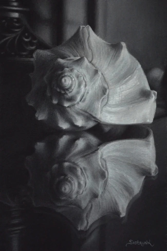
"Quiet Reflection" 6"x4" Pastel and Charcoal on Paper
I began this drawing by first selecting my main subject, a beautiful murex shell. I then staged it in a couple of different rooms but found that it was best showcased in the dining room with its dramatic light and reflective glass tabletop. With my china cabinet behind, and the addition of one of my ornate lamps it helped to add a little something special to the mix. I found the composition to be quite meditative and peaceful; just what I was looking for and so I photographed the scene and began to draw.
Materials:
For this drawing I used a Strathmore 500 paper, a kneaded eraser, a mahl stick, a drawing board, acid free masking tape, General's 6B and 4B charcoal, General's white charcoal, Ritmo 3B charcoal pencil, Caran d-Ache soft charcoal pencil for only my darkest darks, and Cretacolor permanent white pastel for the lightest whites.
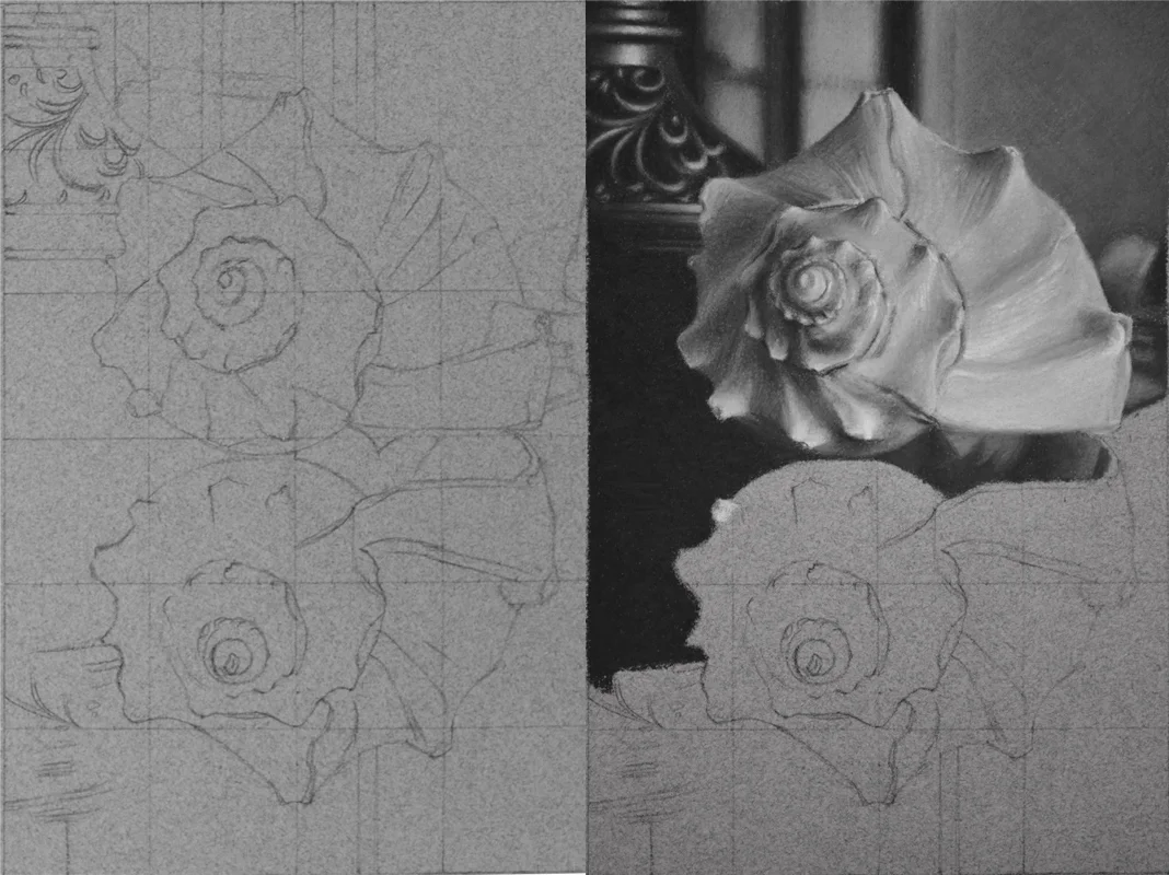
Earlier Steps in the drawing; Left: The initial grid and line drawing. Right: Early into the process of the drawing where I have begun massing in the preliminary values.
Process:
My process at the time involved lightly drawing a grid to help locate major landmarks on the drawing and then connecting them to match the angles and shapes I observed in the shell and other elements. I then proceeded to add layer upon layer of charcoal in order to achieve the appropriate light or dark values of the objects you see in the drawing. During each subsequent layer, I added more charcoal with more pressure, being careful not to burnish the paper so that it would continue to accept more charcoal and pastel yet attaining full coverage of the paper. With each pass of the materials I brought the drawing's values, gradations and textures closer and closer to the desired final appearance. To finish, I sharpened my Cretacolor white pastel to a very fine point and carefully added my lightest highlights with a tiny yet thick impasto of the pastel much in the same way that you would add an impasto highlight in oil paint.