
When painting I use two methods to simply and easily control chroma. The first, and the one I use most frequently, are neutral grays. The second is through the use of close complementary colors. A personal preference of mine is use complementary color strands when I'm painting subjects such as skin and flowers. However, neutral grays will work very well for these subjects as well.
Neutral Grays
Unless your subject is translucent, when rendering three dimensional forms it becomes necessary to subtly lower the chroma as the form drops in value as it turns away from the primary light source. If you were to add black to your mixture to achieve the color for the shadows it would drastically alter the value, the hue and the chroma and cause you to work much harder to find the right mixture. This is where neutral grays come in and simplify the painting process. If you have a strand of neutral gray in different values it becomes quite easy to lower the chroma and value slightly by adding a tiny bit of the proper value of neutral gray to your mixture. This is one of the most predictable ways of neutralizing chroma.
Below you can see a palette containing a strand of red at different values and constant chroma. Immediately below the strand of red is a strand of neutral grays in the values I would need that day. Note that I did not mix the darkest value neutral as well as a couple of others as it would not be necessary for that painting day. If you absolutely know that you will not need those values then save the mixing time and paint. But in the beginning it's helpful to mix a full value range. To achieve the strands of neutral gray I used Iron Oxide black or ivory black, raw umber and white. This combination gives you a perfect neutral gray, and using them in different proportions helps you achieve the different values. You can use the chips from your Munsell Student Text or the big Book of Color for a comparison of neutrality in your paint mixtures. Some companies, such as Williamsburg, have premixed tubes of neutral grays available for purchase.

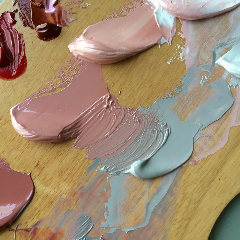
Above you can see a red and a neutral of roughly the same value. When these two are combined in different proportions it is possible to achieve a range of chromas in-between neutral and the chroma of the original red hue.
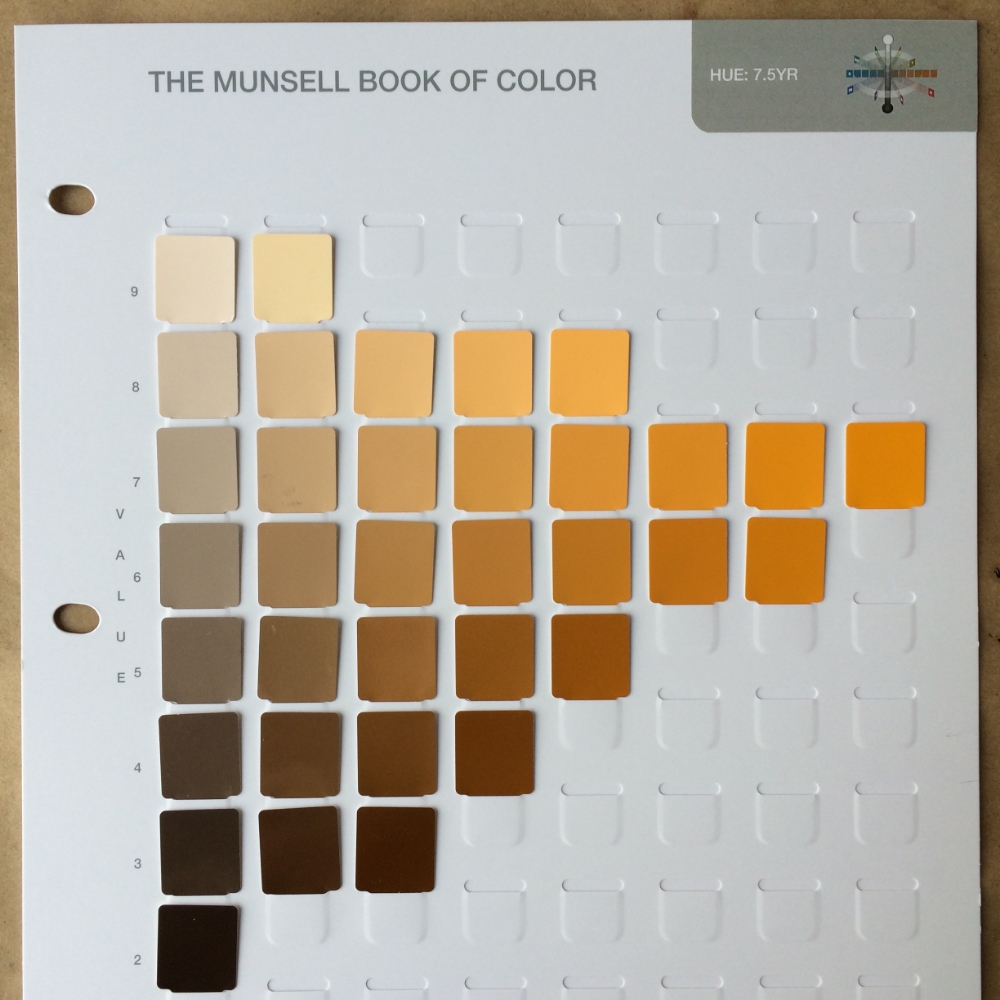
The photograph below is a page from The Munsell Book of Color for hue 7.5YR. The horizontal rows depict changes in chroma at specific values for hue 7.5YR. Chips on the far left are low in chroma, near neutral at a chroma of 2, while the chips on the far right depict the highest chromas achievable at this particular hue and value combination.
Using this chart you can visually see how a specific hue and value’s chroma will change as you add an increasingly higher proportion of neutral gray of the same value. The chips also illustrate the different chromas that are possible with that hue at different values. Note that both lighter and darker values for this particular hue are limited to low chroma.
Complementary colors
The use of complementary colors to neutralize chroma often comes in handy with flowers and flesh tones. The premise and application is the same as the neutral grays except for you would be using color. Be careful to watch for shifts in hue with complimentary colors. Using the chart from The Munsell Book of Color depicted below you can estimate your complementary colors. I left the file size large so that you can print the image. Once you have the hue identified on the wheel you can use a ruler to find the complement that is directly opposite to your hue on the wheel. For example 5R's complement would be 5BG. (Below image from munsel.com)
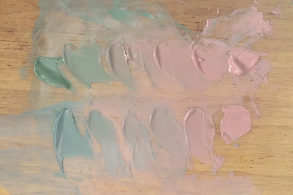
Above you can see a comparison of using a green complement of similar chroma and value on top and a neutral on the bottom. Both achieve the same end of effectively reducing chroma. However, it should be noted that complements often cause greater hue shifts (vs neutral grays) and that may not yield the desired hue.