Depending on the materials and process I will be using for a painting I choose different drawing implements.
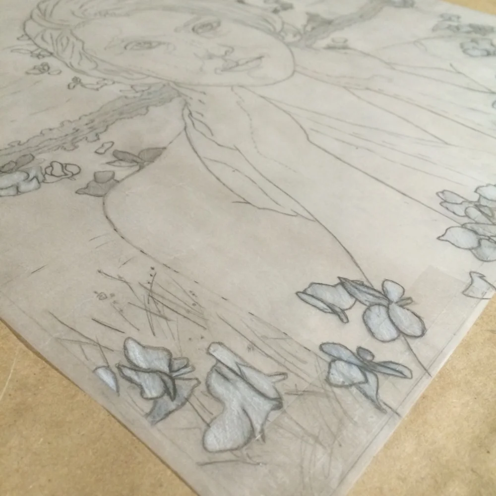
Preparatory drawing for the painting entitled Allure.
Drawing Transfers
For paintings where it is necessary to complete the drawing on paper first then transfer it to the painting surface I use a Staedler Drafting mechanical pencil and 2B refills. This pencil is wonderful for quickly creating a detailed drawing. The cylindrical sharpener efficiently and cleanly achieves an incredibly sharp lead point.
For those of you who enjoy the traditional wood pencils, Tombow Mono Professional Drawing pencils are incredible and smooth throughout the softest and darkest lead to the harder lead lines. The 2B is one of my favorite drawing pencils.
Once I'm satisfied with my drawing I position it over my painting surface. I tape it down and slide a paper that has been prepared with soft charcoal between the painting and the drawing. I then go over all my lines with a mechanical pencil, being careful to revisit all parts of the drawing. I use a small square of foam board to keep my hand from pressing on the drawing and transferring unwanted excess charcoal to the painting's surface. Alternatively, some artists use colored ballpoint pens so that it is easier to discern where the drawing has been transferred and some also photocopy the drawing to preserve the original drawing.
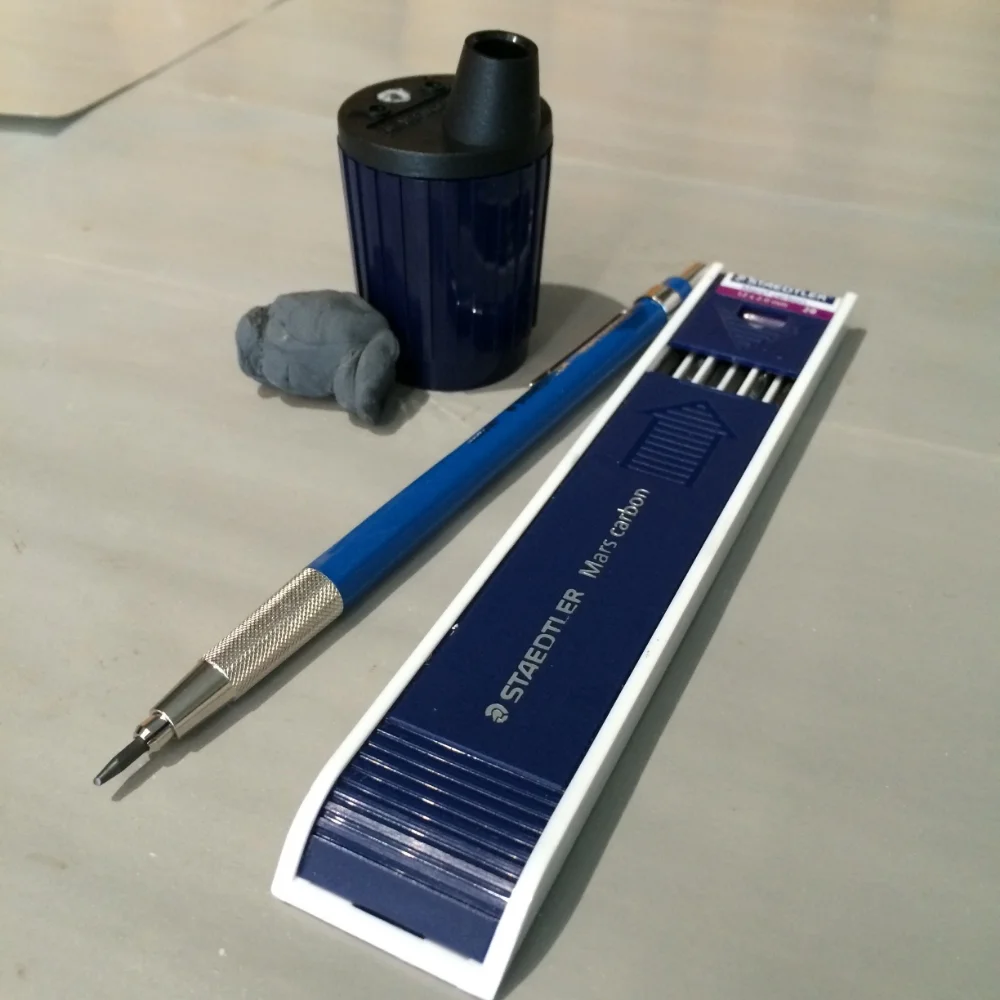
Staedtler Mars Technico Lead Holder (Blick), 2B refills, Staedtler Mars Lead Pointer and kneaded eraser
Implements for Drawing on the Painting's Surface
When it is imperative that the drawing be as accurate as possible it is best to draw on the painting surface. For commissioned portraiture I prefer to draw directly on the ground using Nitram Académie Fusains HB charcoal sticks. I sharpen the charcoal sticks into a point, pictured below, by rotating the end on 400 grit sandpaper. The nitram charcoal is very forgiving and if you need to adjust a line in your drawing it is as simple as wiping it away with a paper towel. Once my lines are exactly as they need to be, I go over them with a 2B Wolff's charcoal pencil and carefully remove all the excess charcoal by dabbing it with a kneaded eraser. This process keeps my ground from becoming dirty or marred in the process of drawing, while retaining the most accuracy in the drawing.
Tombow Mono Drawing Pencils, KUM Sharpener/Lead Pointer and HB Nitram Académie Fusain Charcoal Sticks
My favorite erasers: General's kneaded eraser, Prismacolor's colored pencil eraser and Vanish 4 in 1 eraser that really removes those hard to erase lines.