What is a mahl stick? It is a stick used to support the hand of the artist while painting or drawing. At one end of the dowel there is padding to protect the surface of the painting.
Why use a mahl stick? When painting or drawing for long hours a stick to rest your hand on can be an absolute lifesaver. I use my mahl stick whenever I'm painting anything that requires fine details such as faces, hands, hair and anything else that requires a steady hand. My mahl stick also prevents dirt and oils from my skin from being transferred to my painting's surface. The stick also prevents hand fatigue and pain as it places the wrist in a more comfortable working position. In addition to being more ergonomical it also keeps any wet paint from being accidentally smudged by my hands when painting fine details.
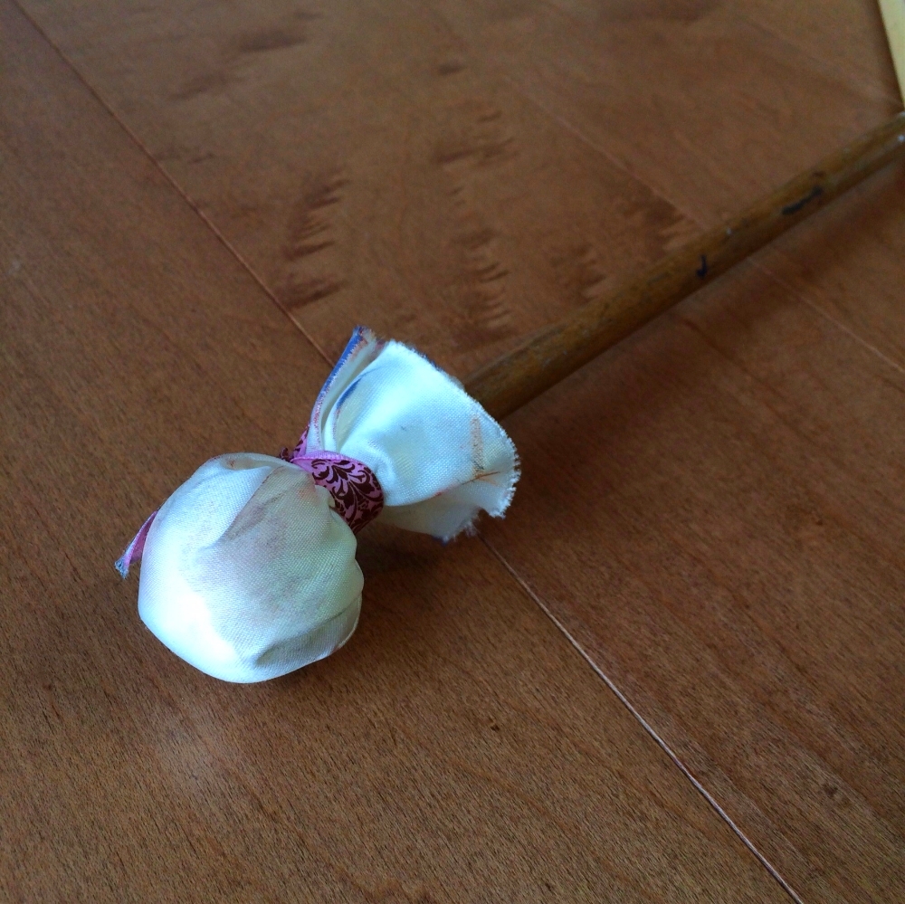
My Mahl stick with a piece of leftover ribbon from my wedding. :)
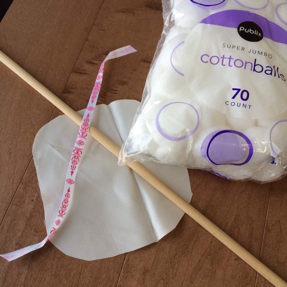
To make your mahl stick you will need a couple of items: A dowel stick from your local hardware store (find a thickness that will support the weight of your arm without bending substantially), a piece of silk, two jumbo or equivalent cotton balls, scissors and a piece of string, a rubber band or a ribbon. I also used 400 grit sandpaper to remove any potential splinters and to smooth out the dowel stick before assembly.
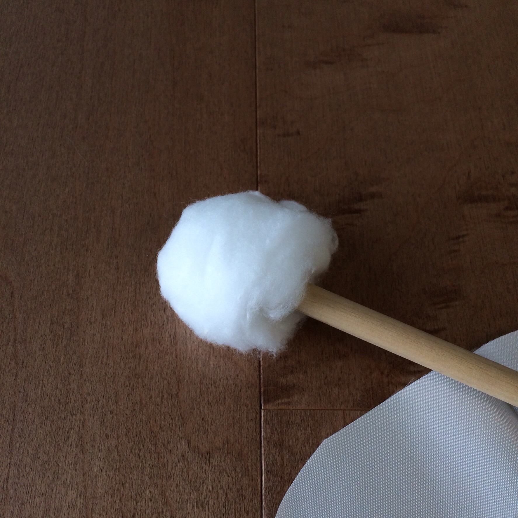
Wrap the of the dowel with two cotton balls. The cotton provides important padding to protect your painting surface from becoming marred by the end of the dowel stick.
Next cover the cotton with a 6.5" square piece of silk and secure it with a string, rubber band or ribbon. I use silk for my fabric because it is lightweight and does not produce lint that could become embedded in the surface of my painting. Chamois leather is also often used. If you have trouble with the cotton and silk popping off the end try the following. With a pencil mark the area on the dowel where the ribbon is tied. Remove the cotton and silk and place a small amount of double-sided tape on the dowel where you have indicated. Next, Replace the cotton ball and silk and trim the excess silk and ribbon.

Using a Mahl Stick:
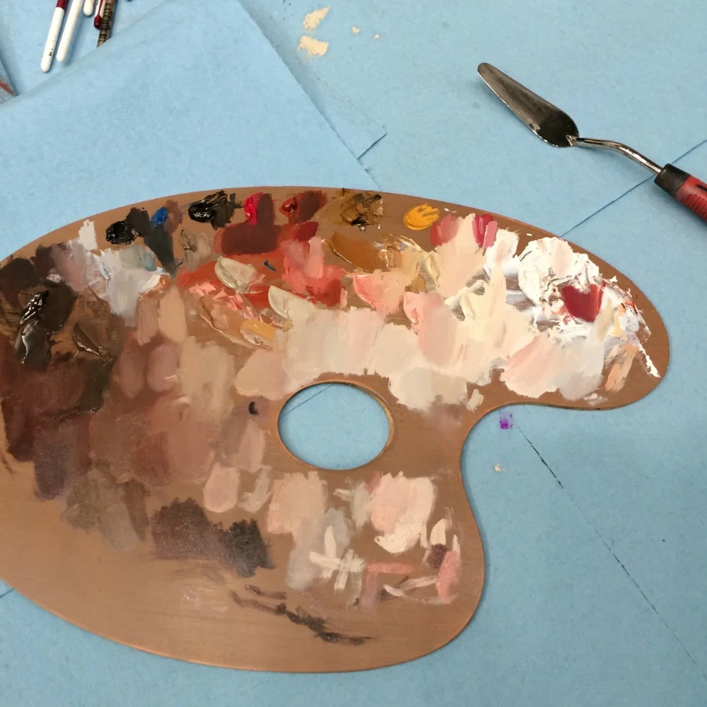
When using the mahl stick hold it in your non dominant hand and rest the covered end carefully on a dry section of your painting or on the edge of your canvas. Here is an example of the mahl stick in action...

With an exciting and enormous project on the horizon I will be changing the schedule of my blog posts to twice a month. Thank you for your support and happy painting to you all!